


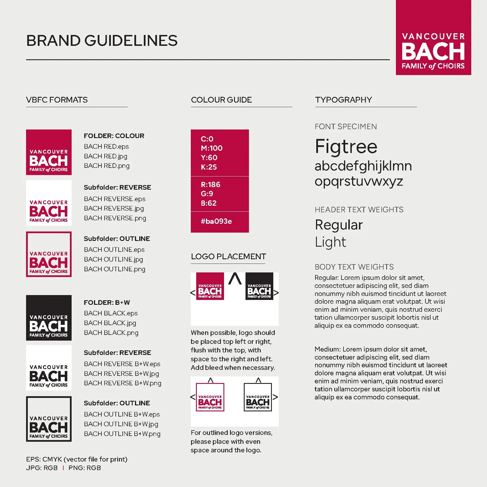
The Vancouver Bach Family of Choirs desired to refresh their brand to reflect its musical tradition while appealing to a wider audience. This new logo and adjusted red colour palette, showcases the choir's dynamism and warmth. This refresh improves legibility in all print and web applications and gives a modern welcoming atheistic. The revamped brand highlights inclusivity and excellence in choral music, embodying the collaboration and artistry of the choir.