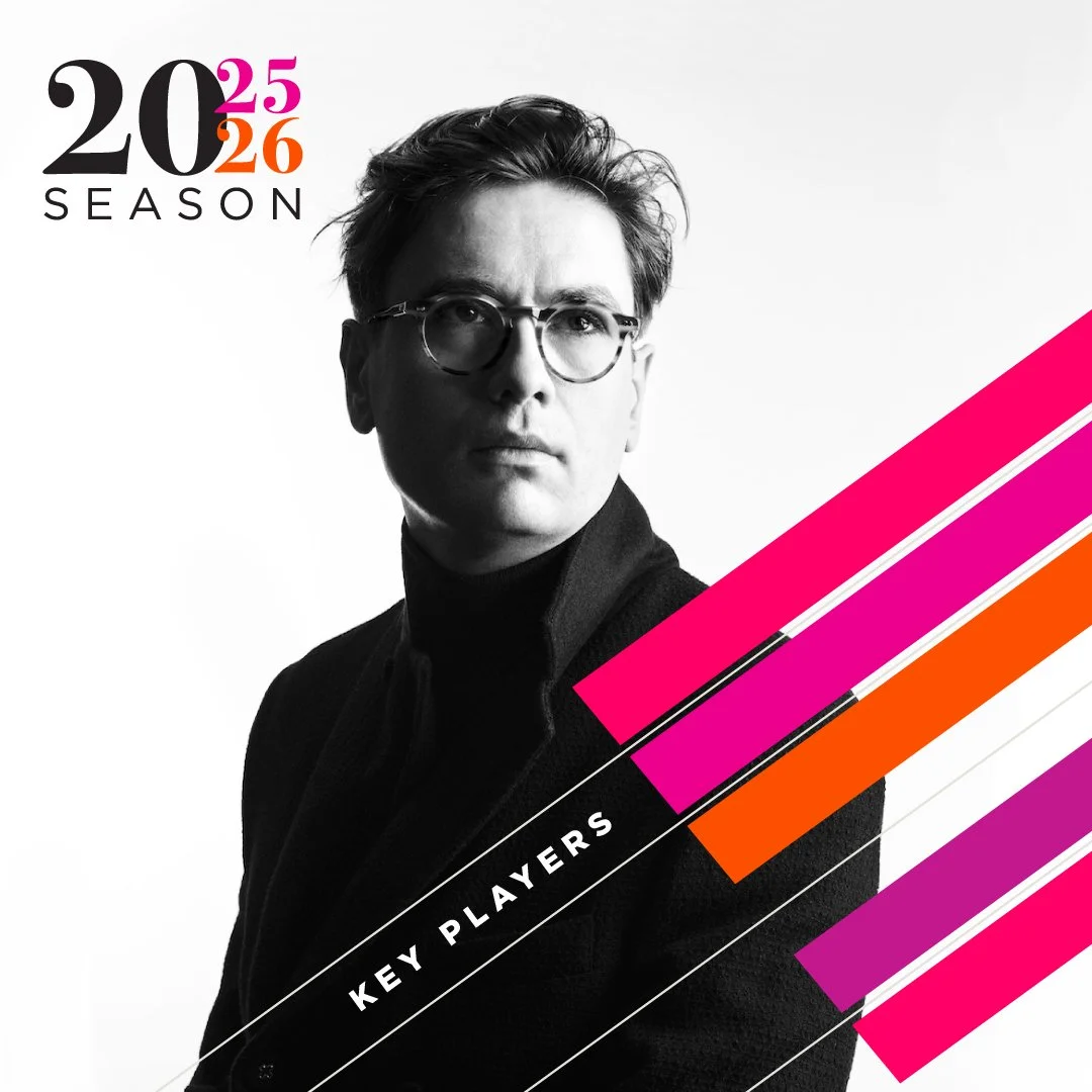
The Vancouver Recital Society (VRS) is a leader in the arts, presenting internationally renowned concert series with celebrated global artists. Copilot Design has strengthened its visual identity starting with a rebrand in 2014, with a focus on reflecting sophistication, energy and artistry. Copilot’s creative designs celebrate performances through uniquely bold branding and cohesive yet ever evolving marketing materials.
Copilot Design had the great opportunity to develop a campaign for the Museum of Anthropology at UBC, marking its grand reopening following an 18-month closure for major seismic upgrades. The campaign spanned print and digital platforms, utilizing transit shelters and buses to engage a broad audience through eye-catching visuals and informative content about the reopening. We aimed to spark curiosity and excitement among potential visitors, inviting the community to appreciate the beauty of the architecture that is MOA, and to support the inaugural celebrations, reinforcing the museum's role as a cultural hub in Vancouver.
The Vancouver Fringe Theatre Society, established in 1983 by a collective of passionate local artists, aimed to provide an essential platform for independent creators. Launching its inaugural Fringe Festival in 1985, the society has celebrated the spirit of creativity annually ever since. For their 40th Anniversary season, Copilot Design was tasked with developing a fresh visual identity that pays homage to the vibrant history of the Fringe. Embracing a retro theme, the design resonated with the community, effectively revitalising the festival's image. The eye-catching campaign captured public attention throughout the city, contributing to a marked increase in festival sales and engagement.
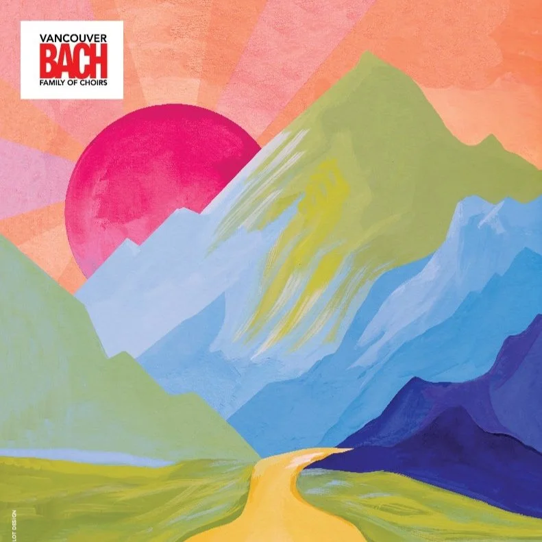
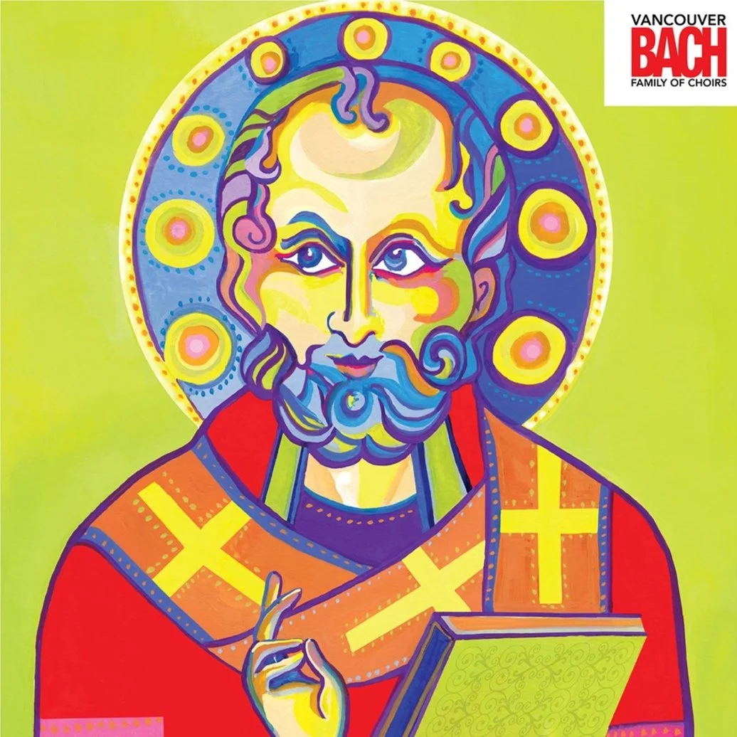
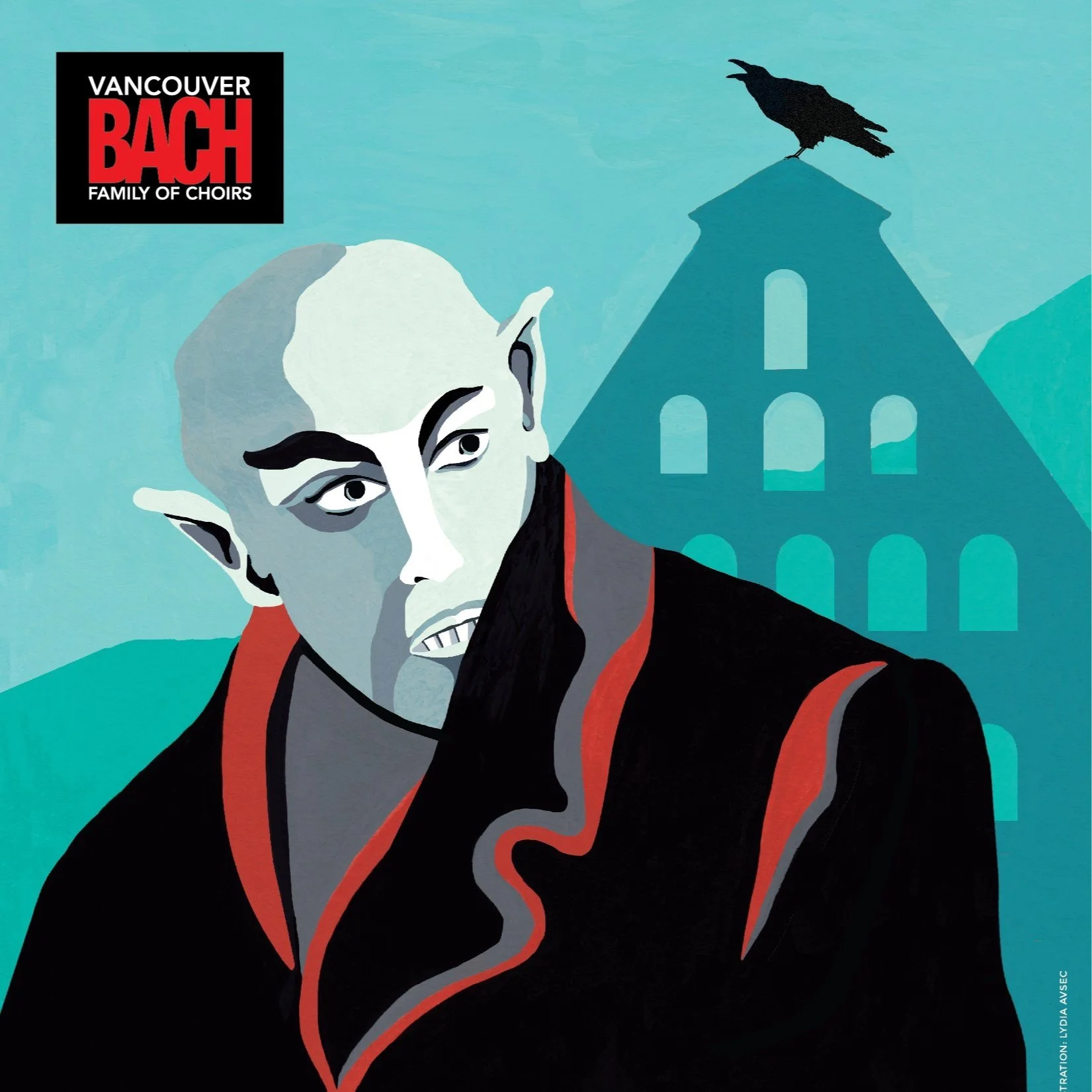
The Vancouver Bach Family of Choirs are a key part of Vancouver's cultural scene, celebrated for its choral tradition and performances. Over the past 13 seasons, Copilot Design has created unique concepts that reflects each season's theme. From research and concept sketches to final poster design, Copilot creates creative that resonates with the choir's mission and audience and enhancing the concert experience by blending art and music. These concepts are developed in gouache on illustration board.
Copilot Design was approached to create concepts, illustration and design for Gateway’s 40th Anniversary Season, a milestone of four decades of creativity and culture. Copilot Design is proud to have contributed through innovative concepts and typography for embodying this ‘Season of Stories’.
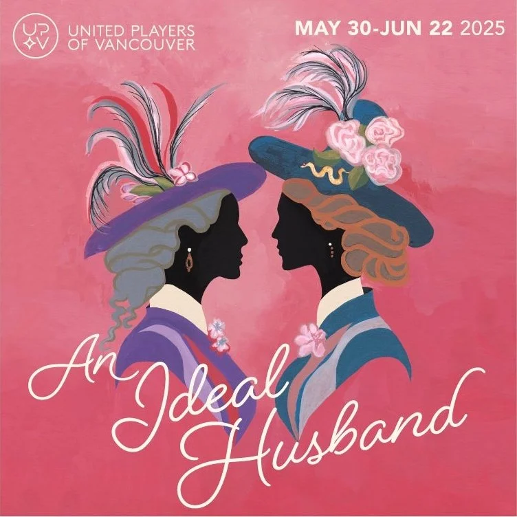
United Players of Vancouver's 2024-2025 season features a diverse repertoire that delights audiences. This esteemed theatre company showcases talented artists in engaging performances. Copilot Design collaborated with the directors of each play to create concepts, illustrations and design that enhance storytelling.
The Vancouver Bach Family of Choirs are a key part of Vancouver's cultural scene, celebrated for its choral tradition and performances. Over the past 13 seasons, Copilot Design has created unique concepts that reflects each season's theme. From research and concept sketches to final poster design, Copilot creates creative that resonates with the choir's mission and audience and enhancing the concert experience by blending art and music. These concepts are developed in gouache on illustration board.
Opera Kelowna is a non-profit opera company delivering exceptional Canadian opera performances in the Okanagan. A flexible template design strategy was needed for their three pillars: performance, education, and community. Copilot devised a system within the’ O’ of Opera Kelowna’s brand, and implemented a colour palette to unify the pillars but allowed each one to stand on their own, with options to change images within the ‘O’. Scarf for main stage performances signifying excitement and movement, a paper airplane signifying out in the community, and a branch of blossoms for education signifying growth. This template system has been implemented in all marketing materials within the organization.
The Vancouver Bach Family of Choirs desired to refresh their brand to reflect its musical tradition while appealing to a wider audience. This new logo and adjusted red colour palette, showcases the choir's dynamism and warmth. This refresh improves legibility in all print and web applications and gives a modern welcoming atheistic. The revamped brand highlights inclusivity and excellence in choral music, embodying the collaboration and artistry of the choir.
The Vancouver Academy of Music’s Symphony Series features exceptional concerts at the Orpheum Theatre and Kay Meek Arts Centre. Copilot created original illustrations and design, integrating creative across print and web platforms for a cohesive experience that reflects the artistry of the Symphony Series.
United Players of Vancouver's 2023-2024 season features a diverse repertoire that delights audiences. This esteemed theatre company showcases talented artists in engaging performances. Copilot Design collaborated with the directors of each play to create concepts, illustrations and design that enhance storytelling.
Getting the attention of alumni and donors can be challenging, and so SFU contacted Copilot Design to help meet this challenge. COVID proved the world of student life on campus had significantly changed, and Copilot created a concept that reflected this new reality. Upon great success of the campaign, Copilot created subsequent years of various fundraising materials, introducing hand drawn illustrations into the mix. This also proved successful, having raised banner amounts during these years.
Black Cat Books founded by author Shanon Sinn, features stories inspired by British Columbia's Pacific Northwest. Copilot Design developed the visual identity, illustration and book cover design which embodies the narratives. The first book marks a significant launch, with a new brand and its inaugural book. Themes of mystery and adventure, showcases the unique storytelling and whimsy of the region. That Witch Whispers is Black Cat Books second in the anthology series, and a unified approach emphasized for cohesive branding. These books are geared towards the young adult demographic.
After three decades of its existing logo, the Vancouver Academy of Music initiated a comprehensive rebranding effort to reflect its evolution and aspirations. Copilot Design undertook extensive research and creative exploration to craft a new identity that honours the heritage of VAM while embracing a modern and innovative aesthetic. The resulting brand harmoniously blends tradition with a forward-thinking vision, capturing the essence of an institution dedicated to excellence in music education.
The Vancouver Bach Family of Choirs are a key part of Vancouver's cultural scene, celebrated for its choral tradition and performances. Over the past 13 seasons, Copilot Design has created unique concepts that reflects each season's theme. From research and concept sketches to final poster design, Copilot creates creative that resonates with the choir's mission and audience and enhancing the concert experience by blending art and music. These concepts are developed in gouache on illustration board.
June Floral & Garden branding by Copilot Design embodies nature's beauty through a blend of organic elements and modern aesthetics. The logo showcases floral motifs with elegant typography, emphasizing artistry and sophistication. The seasonal color palette conveys freshness and vibrancy, creating a welcoming feel. This branding highlights June Floral & Garden's unique offerings and establishes a strong presence in the floral industry.
A commemorative table top book in hardcover and soft cover celebrating the achievements of Peter Wall features a striking 28 page, perfect bound 11” x 11” format. A blind emboss technique on the cover enhances its tactile and visual appeal, creating a sophisticated finish. Typography and image, balances modern aesthetics with readability. This integration of design elements promotes the brand's identity and elevates the overall presentation, in a visually cohesive and compelling look and feel.
The Vancouver Academy of Music’s Symphony Series consists of four main stage concerts in downtown Vancouver’s iconic venue, the Orpheum Theatre, and Kay Meek Centre in West Vancouver. Original concepts, illustrations and designs were created by Copilot and rolled out for both print and web.
The Vancouver Recital Society is a premier concert presenter that offers internationally renowned concert series for world class artists. After extensive research and exploration, the identity was created to fit the personality of the company. Copilot handles all collateral for the VRS such as posters, brochures, postcards, print and online ads.
United Players of Vancouver is a long-established community theatre company renowned for its exciting and demanding repertoire of productions. Copilot Design collaborated with the director of each play to create five original illustrations and design for their upcoming 2022-2023 season.
The Sechelt utility box featuring bears and bees has received positive community feedback. This design highlights local wildlife and promotes environmental awareness, showcasing the significance of bears and bees in the ecosystem. Its vibrant colours and playful imagery engage passersby and strengthen their connection to nature. Residents value the thoughtful representation of these species, reflecting Sechelt's biodiversity. Overall, the project transforms a utilitarian object into inspiring public art that embodies community values and identity.
The Chan Centre required a revitalization to their current brand identity. By using some of the existing elements, Copilot Design brought the identity to a more unified look and modern feel. The new logo coincided with UBC’s updated branding, and was seamlessly integrated into all their marketing materials.
The Vancouver Bach Family of Choirs are a key part of Vancouver's cultural scene, celebrated for its choral tradition and performances. Over the past 13 seasons, Copilot Design has created unique concepts that reflects each season's theme. From research and concept sketches to final poster design, Copilot creates creative that resonates with the choir's mission and audience and enhancing the concert experience by blending art and music. These concepts are developed in gouache on illustration board.
The Vancouver Academy of Music’s Orpheum Series consists of VAM’s four main stage concerts in downtown Vancouver’s iconic venue, the Orpheum Theatre. Original illustrations and designs are created by Copilot and rolled out for print and web.
The Chan Centre celebrated 20 years of exceptional programming, and Copilot designed all the materials to let world know of it’s milestone achievement. The challenge was to engage audiences with the spirit of the Chan Centre without drawing on any one performance. This resulted in a vibrant and diverse range of musicians through colour and non descriptive images of performers. Designing the book of written stories of the past 20 years was the highlight of this project.
The Vancouver Academy of Music brochures combine elegance and clarity to highlight its music education programs. The layout are well-organized, leading readers through programs and services with appealing images and matching brand colours. The typography is easy to read, making important information clear. Graphic elements add a lively touch, representing the Academy's artistic values and commitment to developing musical talent. These designs are both informative and a symbol of the Academy’s dedication to building a strong musical community.
The Wall Exchange is a program that brings prominent intellectuals to Vancouver for a lecture and discussion of key societal issues. Poster designs include speakers: Professor Cédric Villani, Andrew Feinstein, Ali Velshi, Rosalind Picard, and Carl Hart.
The Chan Centre for the Performing Arts has earned an international reputation for its striking design and stellar acoustics. Copilot has designed all of their season materials for the past 11 seasons. Brochures, posters, and ads designed with elegance, freshness and a bold presentation. 2021 shifted things online with the creation of the Chan Dot Com Series. Copilot continued with the Chan until 2022, when they switched to in-house design following the look and feel created by Copilot Design.
United Players of Vancouver is a long-established community theatre company renowned for its exciting and demanding repertoire of productions. Copilot Design was thrilled to work with them to create five original illustrations and designs for their upcoming 2021-2022 season.
Copilot Design was chosen by the District of Sechelt to create an original illustrations for street banners to be displayed throughout the town. Focusing on the beautiful surroundings of Sechelt, and with an acknowledgment of history of local steamship Lady Rose, Copilot created these original works for the District. The response from the community was a resounding success!
The Vancouver Academy of Music’s Orpheum Series consists of VAM’s four main stage concerts in downtown Vancouver’s iconic venue, the Orpheum Theatre. Original illustrations and designs are created by Copilot and rolled out for print and web.
The Vancouver Bach Family of Choirs are a key part of Vancouver's cultural scene, celebrated for its choral tradition and performances. Over the past 13 seasons, Copilot Design has created unique concepts that reflects each season's theme. From research and concept sketches to final poster design, Copilot creates creative that resonates with the choir's mission and audience and enhancing the concert experience by blending art and music. These concepts are developed in gouache on illustration board.
The Vancouver Academy of Music’s Orpheum Series consists of VAM’s four main stage concerts in downtown Vancouver’s iconic venue, the Orpheum Theatre. Original illustrations and design are created by Copilot and rolled out for print and web.
Brent Belsher & the late David Y.H Lui presented the Canadian premiere of the National Ballet of Cuba's production of Don Quixote. Copilot created an authentic design, to try to capture the essence and flair of Cuba. Influenced by early revolutionary poster art and old style typography, the design came together with a personality reminiscent of the 1950’s.
Poster design created for Blackbird Theatre's adaptation of Waiting for Godot. Surrealism, with a bit of humour, were key factors in this creation. The concept was carried forth to the type ‘Waiting’, which was made out of string and incorporates a noose for the 'g' - adding another whimsical reference to the play.
The Vancouver Academy of Music’s main stage concerts are performed at Vancouver’s iconic venue, the Orpheum Theatre. Original concepts and illustrations (gouache on board) incorporated into poster designs were created by Copilot and rolled out for print and web.
Ballet Kelowna's mission is to inspire, educate and entertain through the energy and artistry of ballet. Copilot created their 2014/15 season brochure and poster designs. The creative gave the company the level of sophistication they were looking for.
Pakit is a forward-thinking sustainable packaging company dedicated to reducing environmental impact through innovative design solutions. Brochure design features a clean and bold aesthetic, showcasing their commitment to eco-friendly materials and processes. With striking visuals and compelling messaging, the brochure and website effectively communicates Pakit’s mission to promote sustainability in packaging while appealing to environmentally conscious consumers. The use of modern typography and a cohesive colour palette highlights the brand's modern approach, making it an essential tool for attracting new partnerships and customers.
Blackbird Theatre’s objective: create an eye-catching poster to promote their play Who’s Afraid of Virginia Woolf? Influenced by the work of Saul Bass - responsible for many Alfred Hitchcock posters, Copilot delivered an impactful creative including illustration and design for their print and online campaign.
The Vancouver Bach Family of Choirs are a key part of Vancouver's cultural scene, celebrated for its choral tradition and performances. Over the past 13 seasons, Copilot Design has created unique concepts that reflects each season's theme. From research and concept sketches to final poster design, Copilot creates creative that resonates with the choir's mission and audience and enhancing the concert experience by blending art and music. These concepts are developed in gouache on illustration board.
Vancouver Academy of Music is the city's premiere centre of music education, serving aspiring musicians from early childhood to collegiate levels. Copilot design has created their academic brochures for the past few years. Copilot created interesting, colourful brochures that showcases the energy of the organization.
The Chan Centre partnered with UBC’s Peter Wall Institute for a screening of the CMTTF’s 2012 documentary The Gift of Music: Stories of Music Therapy, exploring the benefits of music therapy in the treatment of diseases such as Alzheimer’s. Original concept, poster design and illustration were Copilot's contribution to the project.
The Koerner Quartet is a Canadian group of musicians with an international reputation for performances with a sophisticated interpretive style. Posters and rack cards were designed for their series of four performances. Each original painting was created while listening to the selected works for each concert.
The Nu:BC Collective and Turning Point Ensemble share the stage for Superimposition, an inventive evening of instrumental music featuring a new concerto for flute, cello and piano, presented by the Chan Centre. As the description suggests, this design layered instruments within the landscape of Vancouver.
Celebrating VBC's 85th Season with a new artistic direction, Copilot conceptualized and illustrated four original paintings for four shows. Design of posters, rack cards, ads, brochures, and web presence, complemented a new Bach Choir '85th year' logo that Copilot developed alongside these works.
The Cultch Rio Tinto Alcan Performing Arts Awards brochure features a bold design that reflects the vibrancy of the arts community it celebrates. With a dynamic color palette and innovative layouts, the brochure highlights artists and performances that impact the cultural landscape. High-quality imagery immerses viewers in the artistry celebrated by the awards.
Joe Fortes, a Vancouver legendary restaurant! Copilot Design was approached to design a special 25th Anniversary edition of the Joe Fortes logo. The packaging design for Joe Fortes Lobster Oil captures the essence of its rich culinary heritage. The design’s modern aesthetics combined with traditional old time elements, reflects the premium quality of the product.
The Royal Winnipeg Ballet needed a new look for all of their marketing materials. Modern typography and clean layouts were introduced alongside stylistic photography. The contemporary look changed the perception of this traditional company. Elements were carried through print, online, and signage. With Copilot laying the foundation, they have continued to incorporate these themes into future seasons.
Original illustration in a style reminiscent of folk art. An outdoor winter scene in a quaint village for their holiday concert, and for Elijah, a scene painted right out of biblical history capturing the story which illuminated Vancouver's night sky through glowing transit shelters.
Blackbird Theatre's adaptation of Moliére's comedy, called for a bold and audacious creative. Painting an original Don Juan as the main focus, with supporting elements relating to the play, Copilot captured the mystery and intrigue of this rogue character.
The Northshore Action on Prevention Task Force is a group with one focus: the prevention of alcohol in the hands of minors. For three-years now, Copilot has been the creative force behind the campaigns. The creative had to be bold, with strong messaging to communicate effectively. We went beyond design to create the tagline ‘Think Before You Let Them Drink’.
Blackbird Theatre's production of Chekhov's Uncle Vanya, called for a classical feel for the creative. Drawing inspiration from the early 1900's, Copilot illustrated the cast based on a photo from Blackbird's press releases.
The branding for the Literacy Network of Durham Region encapsulates its mission to promote community literacy and learning. A clean, bright colour palette evokes inclusivity, while thoughtful typography enhances readability for diverse audiences. Utilizing the circle in the brand, reflects the network's commitment to all community members. The design balances professionalism and friendliness, fostering trust and encouraging engagement with available literacy resources.
Original concepts, illustration and design unify each season. Brochures, posters, ads, transit shelters were all part of the marketing approach. The creative paved the way for future VBFC's seasons creative to continue with original illustration and design.